Daysome changelog
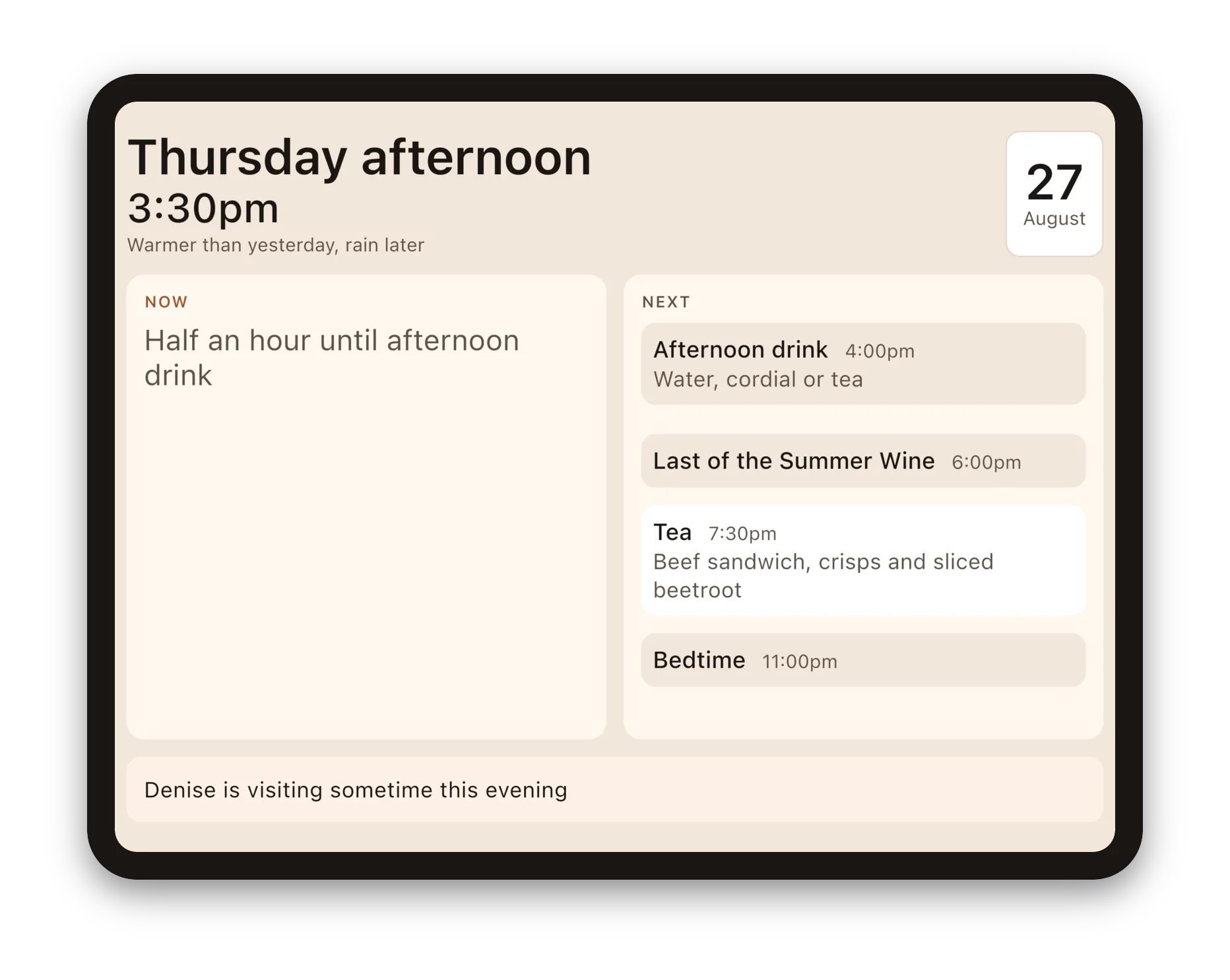
Notable releases and milestones for Daysome, the calm daily display. Release themes are named for the sea areas of the Shipping Forecast, taken in the order they are read out and starting again at each new version: a list recited at the same hours every day for a century, which is the closest thing broadcasting has to the point of this app.
| Version | Summary |
|---|---|
| 0.5.0–0.5.1 | Viking: the household plan, in the stores. The first release to offer the household plan to everyone, on the App Store and Google Play, so a tablet can be connected to a household on daysome.org and the day changed from a phone or a computer. Connecting starts with a free trial; after it, the plan is yearly or a one-time purchase, bought in the app through the store, and it belongs to the household rather than to whoever paid. Daysome on its own is still complete and still free, and nothing on the display changes whichever plan a tablet is on. On daysome.org, a household now opens on Meals this week, with every meal on every day, including the ones the tablet picks from the lists by itself, ready to change with a tap; Today, The routine and Meal lists have tabs of their own. On Android, Daysome no longer contains a Google advertising library that arrived with the store's billing and was never used. The Connect screen sits in the middle of larger screens instead of hugging the left edge. And the privacy policy now says, in plain terms, what connecting a tablet and the weather each send, and to whom. |
| 0.4.1–0.4.11 | Forties: the plan takes shape. Eleven builds for testers, turning a connection into something worth choosing. The Connect screen opens on the plan, set out like a certificate: Free on this device, or the household's plan, with what it includes, the days left on a trial, or when it is paid up to. The household's name is on it, and a household renamed on daysome.org shows its new name on every tablet. A tablet can be removed from its household from the tablet itself, and reconnected later to the same one; if somebody signs in as somebody else, daysome.org asks before starting a new household, so a plan is never left behind by accident. Anybody can delete their own account from daysome.org, without having to ask us. Restore a purchase brings a plan back on a tablet that was reset or replaced. Connection, restoring, removing and deleting each have a card of their own, which makes the screen shorter and clearer. Changes made on daysome.org now reach the tablet in about twenty seconds instead of a couple of minutes, while asking far less of the server. And the weather comes from Open-Meteo's commercial service, which is how it has to be now that there is something to buy. |
| 0.4.0 | South Utsire: the tablet can be reached from somewhere else. Everything Daysome does today it still does on its own, on one tablet, for nothing, and that is not changing. What is new is a way to connect the tablet to a household on daysome.org, so a daughter in another town can change what is for tea. In the settings, behind the PIN, Connect this tablet shows a code of six large characters, drawn from an alphabet with no 0, O, 1 or I. The first person to enter it on the website owns the household and can invite the others; each of them signs in with their own account and can be removed again on their own. The tablet keeps working with no connection at all: changes made in the kitchen wait until it can reach the website, changes made on the website appear on the tablet within a couple of minutes, and if the same thing was changed in both places the later one wins. A household can have more than one tablet. Connecting starts a free trial of the household plan; when it ends, editing from the website stops until somebody chooses a plan, and the tablet carries on exactly as it is. The plan can be chosen on the tablet, in the same settings screen, or on daysome.org, and it belongs to the household rather than to whoever paid, so it survives a change of carer. Nothing on the display changes when the tablet is connected, when the plan runs out, or when the website cannot be reached; that rule is older than this release and this release was built under it. |
| 0.3.0 | North Utsire: room to grow, and a display that keeps its shape. Almost nothing here is visible, and that is the point. The day display could still pick a layout that ran a few pixels past the bottom of the screen at certain window sizes. It is rare, it needs a small window or a resized one, and it is the single thing this display must never do, so the measurement behind it has gone back to being cautious rather than clever. Underneath, the machinery that keeps track of the day has moved to a newer version. It changes nothing about what Daysome does today, and it is the groundwork for the next thing we want to build. |
| 0.2.0 | Viking: the first changes somebody else asked for. Everything before this was our own judgement about what a household would need. These four are not. If you clear the example or erase everything, the meal lists and Meals for the week now offer to add a meal, instead of telling you to go and find another screen: empty was a dead end, which is a poor way to start. A dish on a meal list can be corrected where it sits, rather than deleted and typed in again, because most changes to a meal are a small correction and not a different meal. It keeps its place on the list instead of jumping to the bottom, and if today was already set to it, today follows the new wording. In the editor, the sort of thing that was called "Pills" is now "Something else": Daysome has no notion of medication, and never has, because it is a named line and a time like anything else on the day. And the day no longer breaks in the middle of a word on a phone. A phone is not what this is for, but it should not look broken on one. |
| 0.1.0 beta20–25 |
Fisher: starting over, properly. Clearing the example household and erasing everything are two different things and are now two different buttons, under Reset your data. Clearing the example empties the day ready for your own and leaves your PIN alone, and it only appears while there is still an example to clear, so it can never take a routine you entered yourself. Erasing all content and settings does what it says, PIN included, and puts the iPad back to how it arrived. The example day also lost its medication and gained a television programme at six on weekdays, which is a better example of what the app is for. And whatever is happening now is drawn in white, so it is the brightest thing on the screen: it used to be that a meal later in the day could out-shout the thing in front of you. The settings gained an About page, so you can see which version you have without going back to the store (it is the first thing we will ask if you write to us), along with the licences for the open-source code Daysome is built on. In the example household the shopping delivery now arrives during breakfast rather than tidily after it, which is what a real delivery does, and it shows what the display does when two things are happening at once. The settings also go back to the day after half a minute again, as they were always meant to: they had quietly started taking three. |
| 0.1.0 beta18–19 |
Tyne: it speaks up, and it remembers birthdays. The display now makes a soft sound when something starts, so it works whether or not she happens to be looking at it. One low bell, not a doorbell and not a phone, because neither of those should be a thing this app can seem to be. Meals, drinks, tablets and visitors chime by default; the shape of the day does not, and everything can be set on its own. There is a Hear it now button in the settings, because whether the volume is up is most of whether any of it works. And special days: a birthday or an anniversary, written in your own words, showing all day. They are kept in a list you can see and take things off; a date that comes round every year should never be something nobody can find. Setting one asks for a month and a day, with no year to argue about. And the household's meal lists (what you actually eat, as opposed to what is on which day) now have a place of their own in the settings instead of being tucked behind a particular meal on a particular day. |
| 0.1.0 beta17 |
Forth: room to grow. The carer's settings had become one long screen with everything piled at the bottom of it. Behind the PIN there is now a short menu: today, meals for the week, the routine, the weather, the screen, the PIN. Today is the first thing on it and there is a Today button in the bar from everywhere else, so the day is never more than one tap away. The routine (everything that happens and which days it happens on) has a page of its own instead of sitting under today's list. Editing a meal now shows what is actually on the plate rather than saying nothing was chosen, and the clock and battery are legible again on the display. |
| 0.1.0 beta16 |
Cromarty: snags off a real device. Clearing the town left yesterday's weather phrase on the display; it now goes when the town does. The weather settings say plainly that this is the only part of Daysome needing a network, that it works without one, and what the weather service is and is not given: with links out to Open-Meteo and to the licence. Finding a town is clearer to use: a heading, a proper search box and a line saying what to do. |
| 0.1.0 beta15 |
Cromarty: the words it uses about people. The settings said "her display" and "what she would be having". The next household is as likely to be a father as a mother, so nothing in the app assumes any more: it names the thing where it can, and says "they" where a person is meant. The weather settings now show the phrase that is on the display, so you can see what it says without leaving the room, and credit the weather service beside it. Underneath, plainly it states that this is the only part of Daysome that needs a network, it works without one, and the service is not given anything linked to anybody. |
| 0.1.0 beta14 |
Cromarty: the weather, for real. The line under the date has always said what sort of day it is, "warmer than yesterday, rain later", and until now it said the same thing every day. Name a town in the settings and it is true: yesterday's temperature as it actually turned out, compared with today's, in the words a person would use rather than a figure to interpret. Where little has changed it describes the day instead of comparing it, because "about the same as yesterday" does not tell you whether to put a cardigan on. Rain is mentioned only while it is still ahead of you. The app never asks the device where it is, and it needs no location permission: a carer names the town once. With no connection the last phrase stays up, and it is never left up on the wrong day. |
| 0.1.0 beta8–13 |
Forties: the carer's half catches up. The display was ahead of the surface behind it, and this closes the gap. Meals can now be planned a week out rather than only for today, which is what a carer who visits twice a week actually needs; the whole routine is visible, so a weekly cleaner is no longer invisible six days in seven; and a meal can be chosen from any of the household's lists, because in a real house a ready meal is a ready meal. Every step has a way back that does not throw the carer out onto the display. On an iPad the pickers and dialogs are Apple's own. And the bundled example household can finally be cleared: it could not be before, which also meant an example note about a visitor who does not exist stayed on the display for good. On the display itself, two things happening at once are now both shown, and the sentence that counts down to what is coming names both of them. Three snags found on real phones close it out: the way into the carer's settings was too small on a tall screen, clearing the example household gave no sign that it had worked, and the app called every device an iPad. |
| 0.1.0 beta7 |
South Utsire: ready for the stores. The whole listing: a launcher icon and feature graphic drawn from scratch, full store copy, and a scripted screenshot set covering the App Store's 13-inch iPad and both iPhone sizes, Google Play's phone and 7- and 10-inch tablet slots, and the Amazon Appstore's Fire Max 11. Accessibility Nutrition Labels answered honestly rather than optimistically, which meant earning Reduced Motion: the one route transition in the app now stands still when the setting is on. Eight dependencies that nothing imported came out, taking POST_NOTIFICATIONS and VIBRATE with them; the release build now asks for no user-visible permission at all. |
| 0.1.0 beta5–6 |
North Utsire: a second target, and a display that measures itself. Amazon Fire tablets confirmed as a real target rather than a curiosity, with the constraint that follows (no Google Play Services) made executable by a release audit that fails the build if one ever appears. Reading the real numbers off a Fire Max 11 immediately found a bug the guessed ones had not, and the fix ran deeper than the bug: every part of the display now measures what it is about to draw, at the width it will be drawn in, instead of assuming a worst case. The schedule stopped shedding rows it had room for, and a 7-inch tablet stopped dropping the weather line and the date off a page that was a third empty. |
| 0.1.0 beta1–4 |
Viking: the display, and a route to both stores. The first working day display: the weekday and part of the day in large plain words, the time nearly as large, what is happening now and what is next in two slots that never move, a menu on each meal, the weekly visitors that make a Monday unlike a Friday, and a note from the family that takes itself down when it stops being true. Behind five taps in a corner and a PIN, supervisor mode: the whole day, editable, with the meal swap it exists for. The screen holds itself awake, the household survives the iPad going flat, and Fastlane and self-hosted CI carry the same tag to TestFlight and Play Internal. |